

Case of Story – Talagante Hospital – Making health data understandable for patients
This was a voluntary initiative, developed independently after conducting user research with patients and healthcare staff. The solution evolved into a pilot program. The pilot aims to improve patient health outcomes and reduce missed appointments.
Context
Clinical reports often present complex data in formats that are unfamiliar to patients, making them difficult to interpret and emotionally disconnecting from the treatment process.
Health programs for obesity and chronic conditions rely heavily on data:
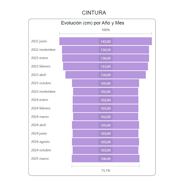
- weight evolution
- body composition
- progress over time
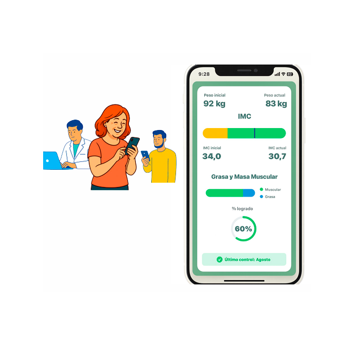
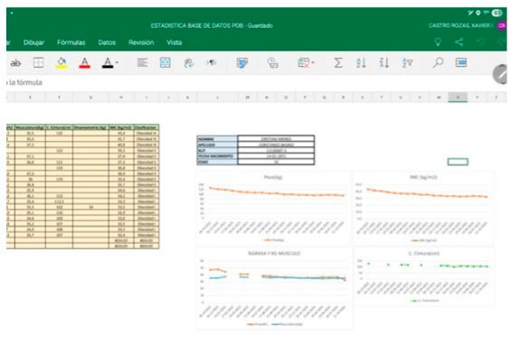
However, patients were being presented with complex spreadsheets and technical charts that were difficult to understand.
This created a critical gap:
Patients could not clearly understand their own progress.
Challenge
How can complex medical data become meaningful for patients?
The problem was not the lack of information.
It was that:
- data was too technical
- visuals were not intuitive
- there was no emotional connection to progress
Translating clinical data into understandable health education
Approach
I applied a user-centered methodology (UX + design thinking):
- interviews with healthcare staff
- patients testimonials
- analysis of existing materials
- User’s journey
- Afinity notes
- User persona
Then, I reframed the problem:
Patients don’t need more data — they need to understand their story.
Insight
Medical data becomes meaningful only when people can see:
where they are
where they are going
and that progress is possible
Design approach
To reduce this gap, I designed the report using a structure inspired by a highly familiar format: household utility bills (electricity and water), which people regularly use to understand consumption, status, and progress over time.
Instead of introducing a new visual language, the design leverages an existing mental model that users already know how to read.
Science communication principle
This approach is based on a key principle in science communication:
people understand new information more easily when it is presented through familiar structures.
By framing clinical data in a format similar to utility bills:
information becomes easier to scan key indicators are immediately recognizable cognitive load is reduced. This allows patients to focus on meaning rather than interpretation.
Storytelling strategy
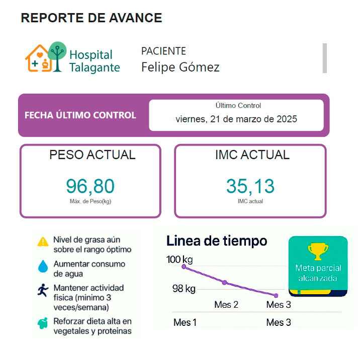
The report was designed as a progress narrative, not just a data summary.
By combining:
- clear key indicators (weight, BMI)
- a visible timeline
- visual milestones and achievements
- the experience mirrors how people naturally track progress in everyday contexts, such as reviewing consumption or monthly bills.
Outcome
The result is a communication system that transforms clinical data into an intuitive and actionable experience, helping patients understand their condition, follow their progress, and engage more actively in their treatment.
Familiar srtuctures help people understand complex information faster
The system included:
- simplified progress dashboards
- clear key indicators (weight, BMI, milestones)
- timeline-based visualization
- visual cues and achievements (gamification)
- structured storytelling of progress
Impact
- Patients better understood their progress
- Increased engagement and motivation
- Reduced anxiety caused by unclear information
- Strengthened communication between patients and healthcare teams
Reflection
This project reinforced a key principle:
Data alone does not change behavior.
Understanding does.
Severity degrees became easier to read when medical categories were translated into visual states (by color):
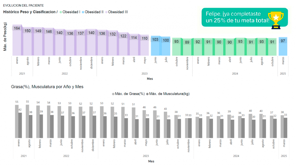
By widening and narrowing horizontaly, the graphic echoes the body itself and turns measurement into intuitive understanding: